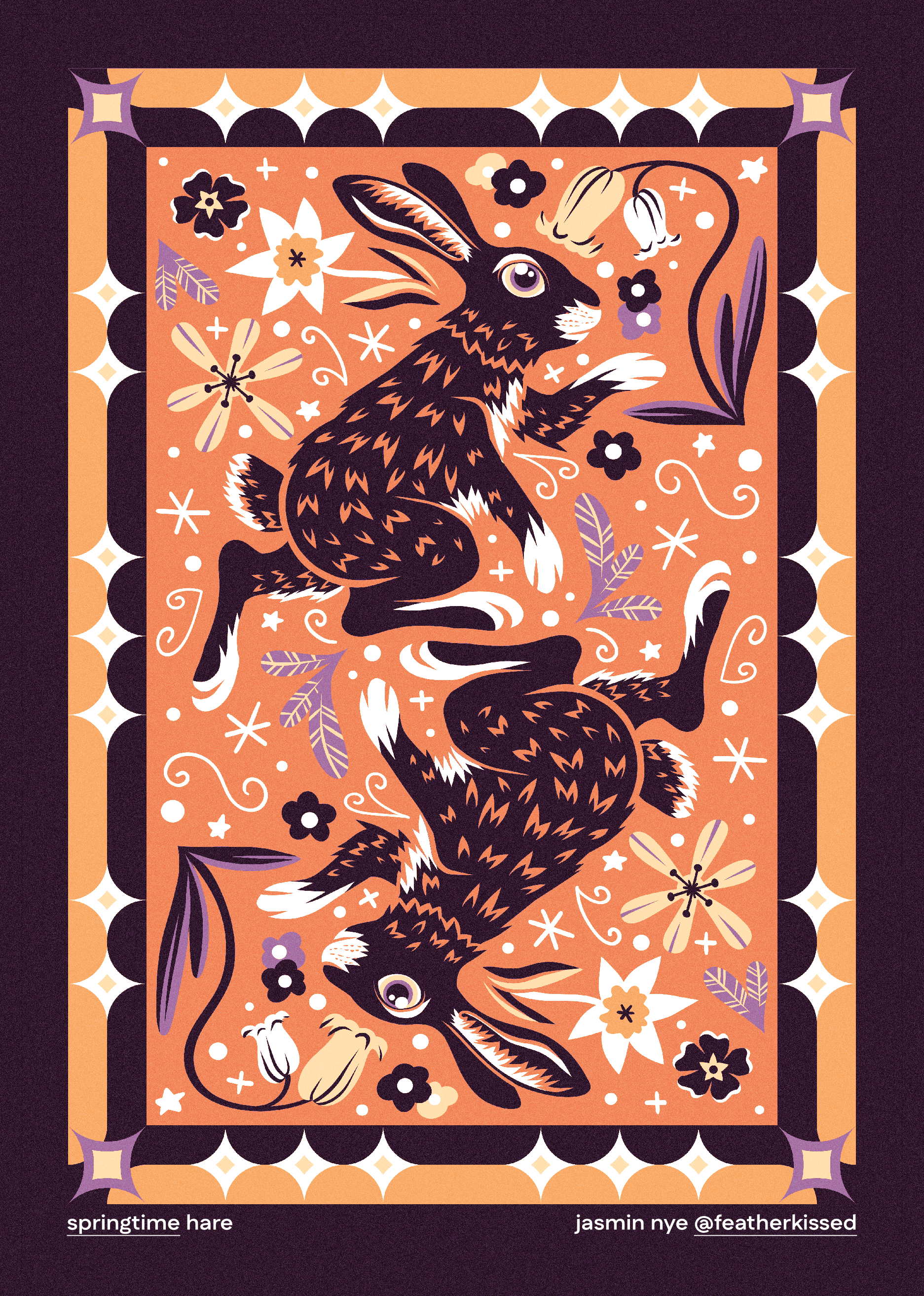
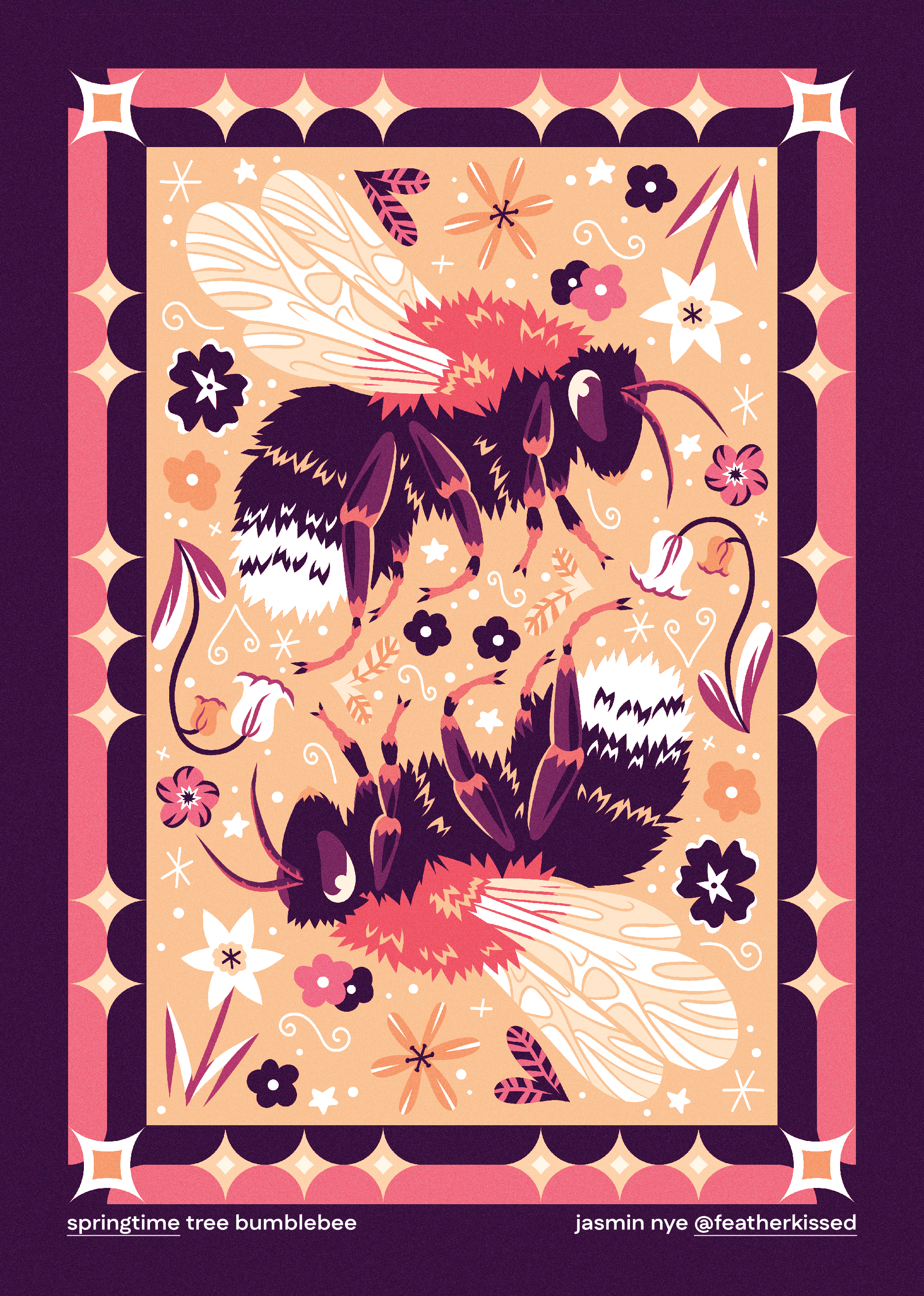
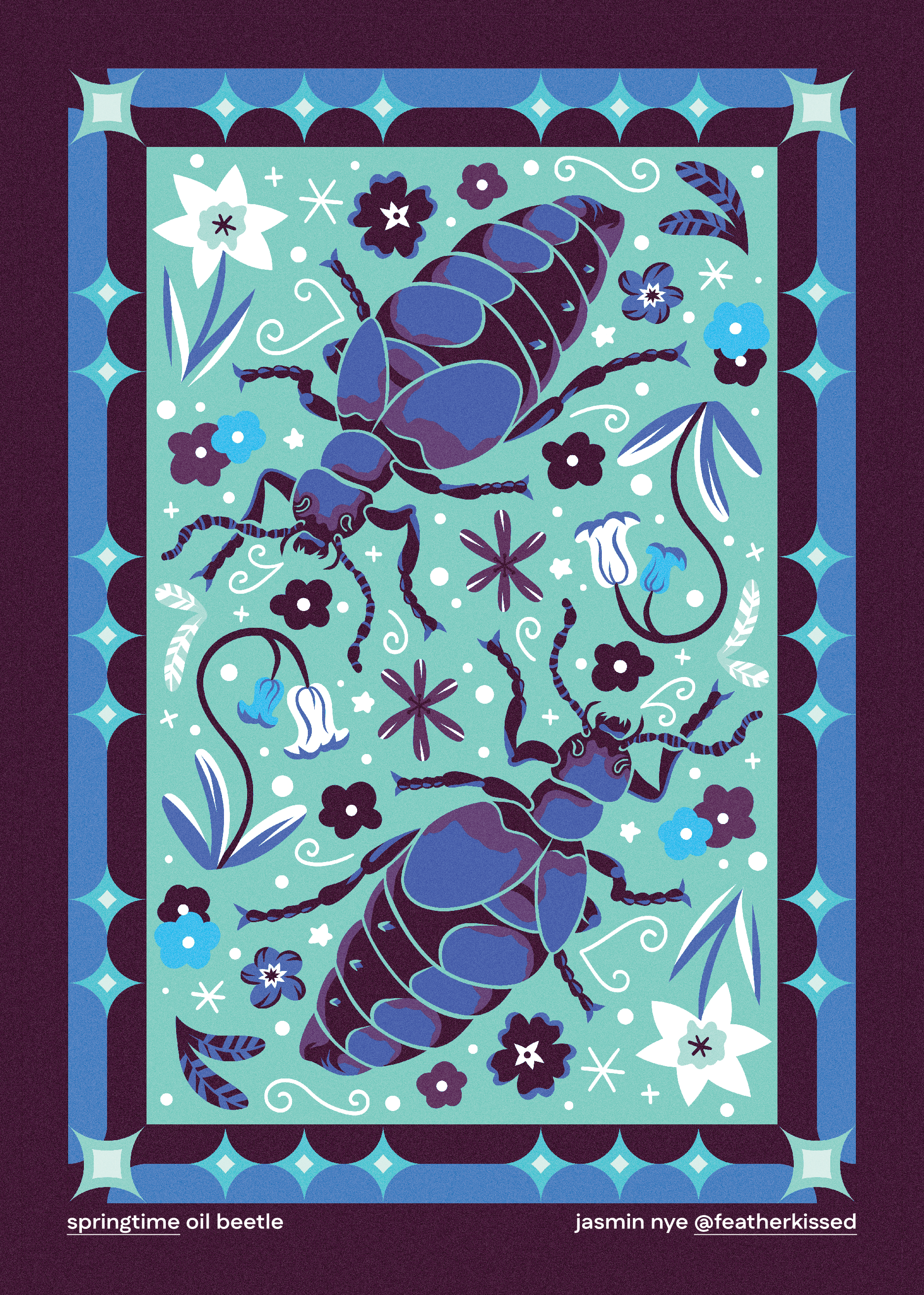
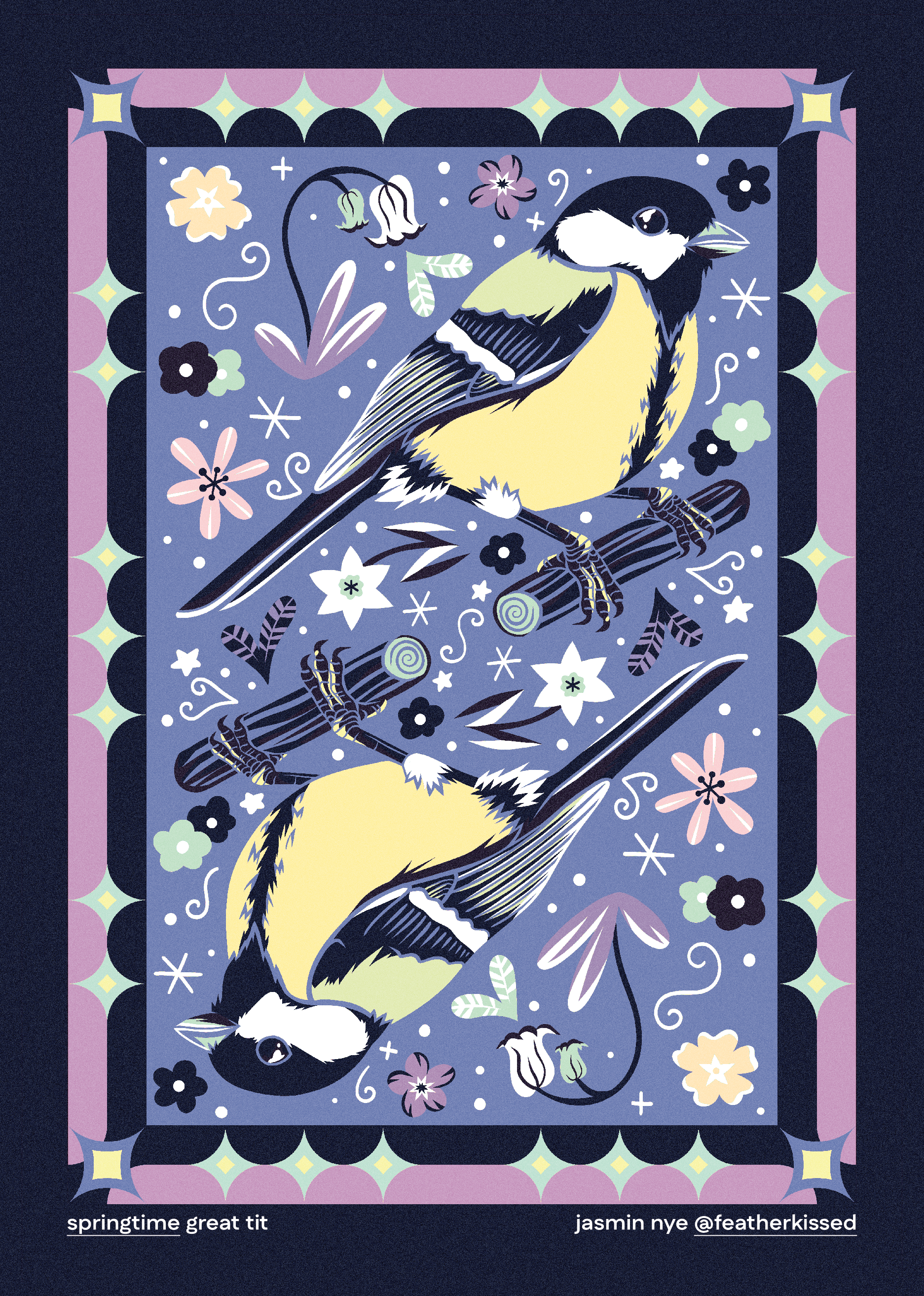
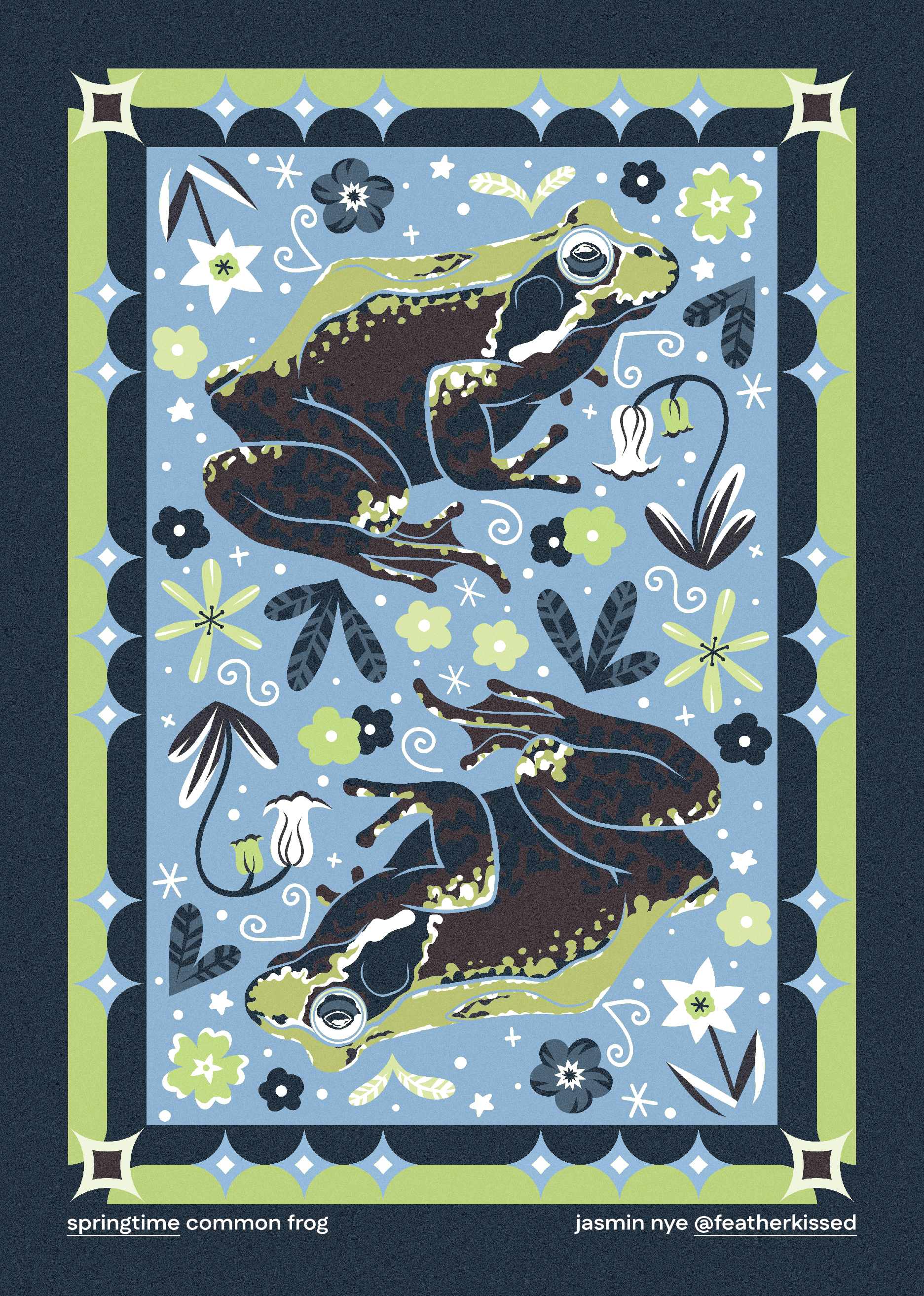
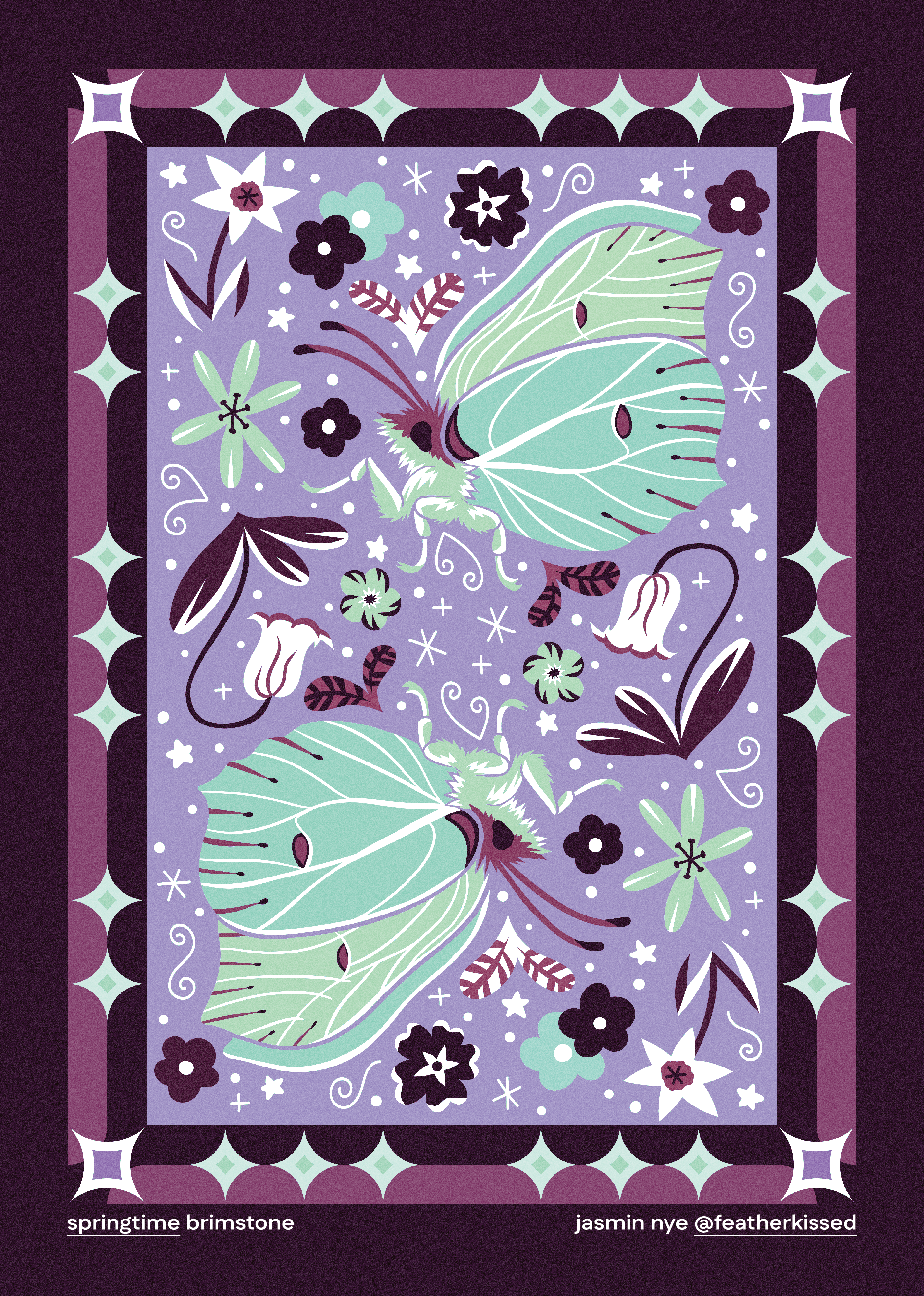
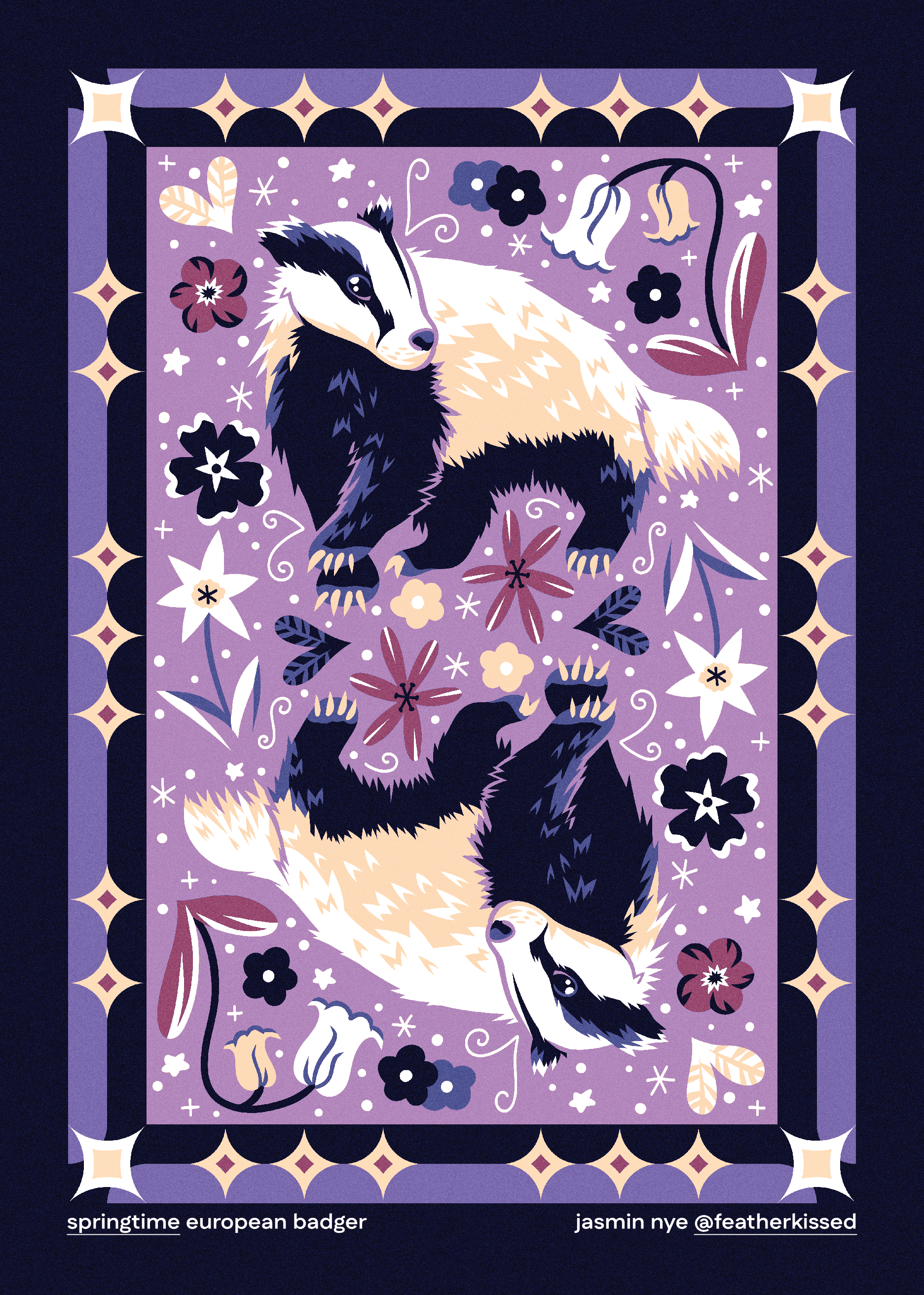
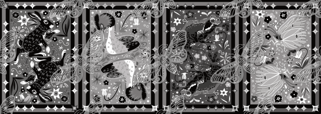
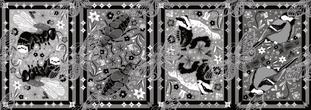
Super excited to share my completed springtime wildlife illustration series! It includes 8 different species commonly seen around the United Kingdom as the season of spring rolls in.
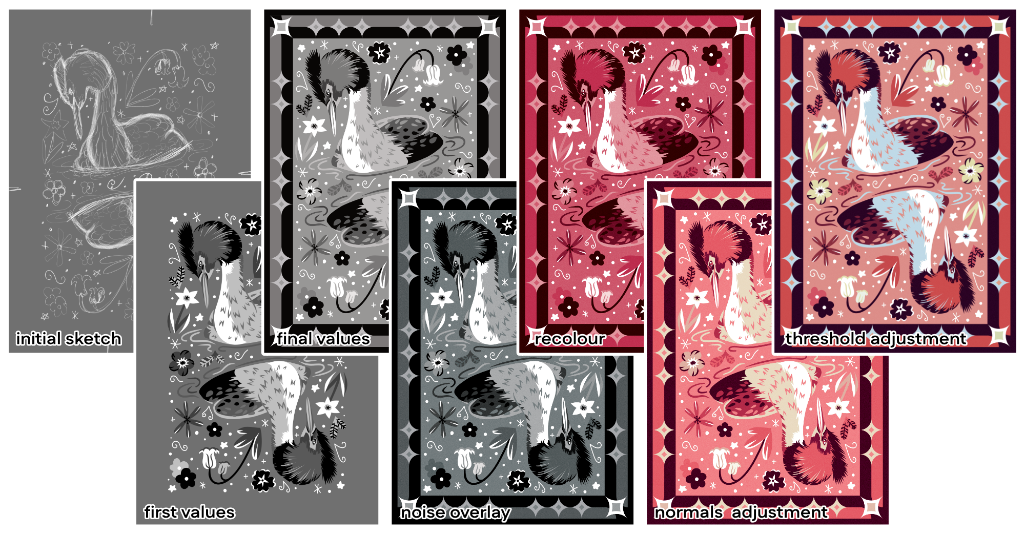
Everything here was drawn in Adobe Fresco on iPad using vector brushes. I’ve always been fond of the lino / woodcut style so decided to go with that for this series! I illustrated each piece in grayscale values so that I could make sure each little doodle, flower & section of the animal could be clearly read against the background. I also a big fan of doodling so I made sure to add lots! It makes the artwork look fun & interesting to look at.
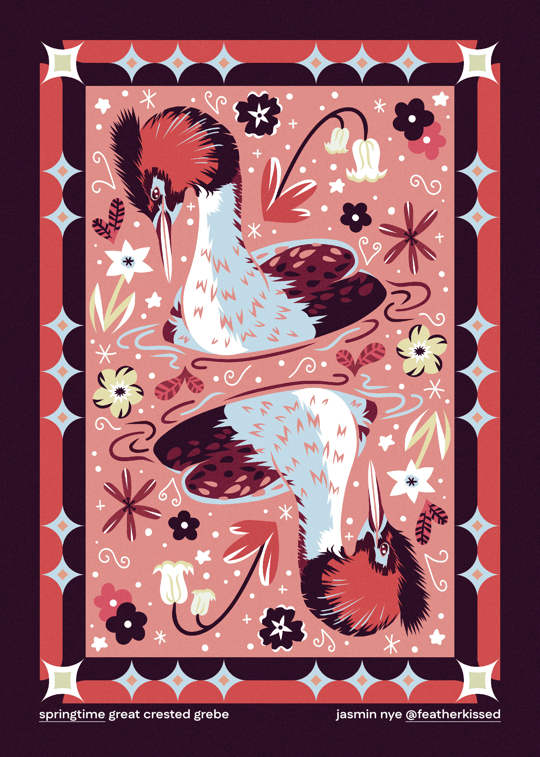
Once I’ve decided on the values, I move onto the bulk of the editing process with Affinity Designer 2. First we had a texture overlay using noise (basically making it look a little “fuzzy”), I do this so it appears more whimsical! Next we go through the recolour stage where I’m now adding colour to the grayscale values. I usually pick a hue that relates to the animal, i.e. for the example below, Great Crested Grebes have a striking red orange marking on their face!
The next step is adjusting the normals of the mapped colours. Essentially this lets me tweak the colours ever so slightly to bring in a new hue to the artwork. For my Grebe below, you can see this added in some pale yellows & peaches. Once I’m happy with that I include a threshold adjustment which again, allows me to add in more colours! You can now see we have some blues, which helps the illustration become less warm by adding in some cooler colours. Now the colour palette is more balanced and is very appealing to view!
Sometimes it can take quite a few attempts to find the right “palette” so I’m always flipping back and forth between the recolour, normals & threshold adjustment layers. It does require a little bit of patience until you hit the colour balance that makes the illustration pop!